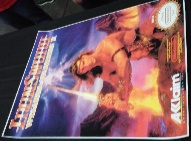
It’s no secret I have a bit of a, ahem, fixation on the high-fantasy games of my 1980s youth. The Wizards And Warriors series on the Nintendo systems is itself a frequently revisited favorite. At last year’s Portland Retro Gaming Expo, I pretty much fell all over myself over this Ironsword poster my boyfriend bought for me.
As I’ve been dipping my toes into game design myself and reviewing work by developers whose aesthetic I enjoy I’ve recently stumbled across the blog of the Pickford Brothers, a pair of game designers known for creating the iconic styles of many games including two Wizards And Warriors titles. To my delight, they have several behind-the-scenes posts regarding the development of Ironsword (and a few for Wizards And Warriors III that are interesting as well). Among them:
Back story of the map screen (admittedly inspired by the one for Ghosts N Goblins).
Development of the title screen, including interesting details on how innovative (and memory expensive) it was. Apparently the aesthetic was influenced by Commodore 64 loading screens.
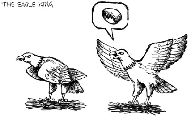
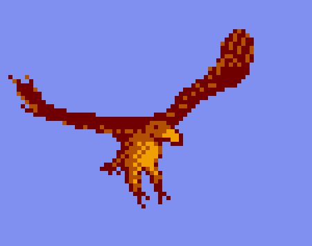
An early mockup of the Eagle King, that was not used in the game. The game version does not show the Eagle King until after the Golden Egg is procured, which leads into this interesting post of the character development that also goes into sprite creation.
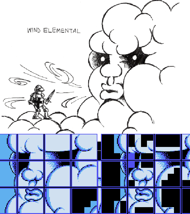
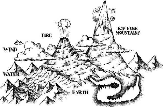
Also there are great images of concept art including Icefire Mountain, the Dragon King, the Earth Elemental, and this post about the Wind Elemental that goes into more detail on converting from concept to in-game graphics. Really cool stuff, and a great resource for folks interested in the creative process within technical limitation aspect of game development.